Home

Showing posts with label Tested Product. Show all posts

Tuesday, January 9, 2024

Unraveling the TSO500 Workflow: A Deep Dive into TSO500 Workflow Verification

As a software tester in the genomic healthcare technology field, my responsibility is to ensure the smooth functioning of the TruSight Oncology 500 (TSO500) workflow. This involves overseeing the journey of genetic data from the initial sample processing to the generation of comprehensive health reports, using pre-existing sequencing data. My goal is to clarify the process and highlight the critical steps, particularly the seamless integration of data into the Pierian system.

The Initial Phase: Accessioning and Plasma Batch Creation

The process begins with "accessioning," where each blood sample is meticulously cataloged with a unique identifier. This step is akin to assigning a library card to every book, ensuring each sample can be tracked throughout its journey. Although I work with pre-existing sequencing data, I simulate this step to maintain the integrity of the workflow. Following accessioning, we proceed to create plasma batches. While the lab's capacity allows for up to 192 samples in a single run, my testing typically involves 2 to 4 batches. This scaled-down approach enables me to concentrate on the system's efficiency and accuracy in a more controlled environment.

The Role of DRAGEN: A Black Box in the Workflow

DRAGEN (Dynamic Read Analysis for GENomics) is a key component in the analysis of genetic data, known for its speed and accuracy. However, as a software tester, I do not verify the data analysis within DRAGEN. Instead, my role is to ensure that the data reaches the Pierian system correctly. DRAGEN remains a black box to us, meaning we trust the analysis conducted by DRAGEN without direct verification.

Ensuring Data Integrity and Workflow Efficiency

My primary focus is on the following stages:

  • Data Analysis: While I don't verify the data analysis within DRAGEN, I monitor the workflow to ensure that the data is being processed and sent out correctly.
  • Data Transfer: A critical part of my role is to confirm the successful transfer of data from the DRAGEN platform to the Pierian Clinical Genomics Workspace, maintaining the integrity of the genetic information.
  • Report Generation:
    I evaluate the Pierian platform's ability to produce comprehensive and actionable health reports from the analyzed data.

Integrating Comprehensive Insights: Beyond TSO500

Once the Pierian report is finalized, it is sent to our order management system, where it is merged with other test reports, such as AR-v7 or DefineMBC. These additional tests provide a broader view of the patient's genomic profile, enhancing the personalized care approach.

AR-v7 is a critical test for metastatic prostate cancer, indicating resistance to specific treatments.

DefineMBC offers a comprehensive profile of metastatic breast cancer, analyzing circulating tumor cells (CTCs) and cell-free DNA (cfDNA) to detect genomic alterations that guide personalized treatment strategies.

Conclusion

My role in testing the TSO500 workflow is crucial for ensuring the workflow's accuracy and reliability. By monitoring each step and confirming seamless integration with PierianDx, we help ensure that the platform delivers clinically actionable insights essential for personalized patient care. This blog post aims to provide a clear understanding of the complex process of turning DNA data into a health report from a software tester's perspective, emphasizing the operational side of the workflow and the importance of data integrity in the overall process.

Thursday, March 23, 2023

Pitch Perfect or Out of Bounds? A Gamer's Review of Cricket 22 on Switch

Hey fellow cricket enthusiasts and gamers! I've been diving into the digital pitch of Cricket 22 on my Nintendo Switch, and let me tell you, it's been quite the adventure. From the roar of the crowd to the crack of the bat, this game brings the excitement of cricket right to your fingertips. But no game is without its quirks, and I'm here to give you the scoop on what's hot and what's not in Cricket 22.

Test Environment:

  • Console: Nintendo Switch
  • Version: 1.0.0

Courtesy: Big Ant Studios

My Game Plan:

I mixed up my gameplay with a bit of everything – career mode, quick matches, and the thrill of online challenges. I also put on my detective hat, using some smart testing strategies to really get into the nitty-gritty of the game.

The Detective Work:

  •  Boundary Value Analysis: Pushing the game to its limits, I tested everything from epic high scores to the nail-biting finishes.
  • Error Guessing: I tried to outsmart the game, predicting where it might trip up, like when I sneak in a quick single or push for a risky double.
  • Equivalence Partitioning: I played with all sorts of deliveries and batting shots to see if the game could handle my all-rounder skills.
  • State Transition Testing: I switched things up, hopping between game modes and saving my progress to test the game's versatility.
  • Exploratory Testing Charter: I zeroed in on specific features like career mode, responsiveness, and those all-important graphics.

Courtesy: Big Ant Studios

The Good, The Bad, and The Glitchy:

What I Loved:

Cricket 22 really does bring the stadium home, with a stellar lineup of teams and competitions. The controls are intuitive, making batting and bowling feel like second nature.

What Needs Work:

  1. Career Mode Hurdles: Ever dreamt of leading your team to glory? Well, you might hit a snag. Sometimes your created player just doesn't make the cut for the match lineup, leaving you benched and missing out on the XP action.
  2. Batsman Blues: When it comes to quick runs, every second counts. But sometimes, our virtual batsmen seem to be stuck in the mud, leading to some frustrating run-outs.
  3. Visuals That Don't Bowl You Over: We all love a game that looks as good as it plays, but Cricket 22's graphics might leave you wanting more, especially when compared to other sports games out there.

The Game Changers:

  1. The Infamous System Crash: Imagine this- you've just downloaded some cool extra content, and you're ready to play, but then – bam! – the game crashes, and all that new content vanishes into thin air, along with your precious game data.
  2. Player Info Mix-up: You're all set to play as your favorite star, but wait a minute – the stats are all wrong! Yep, some of the player info is about as accurate as a blindfolded umpire's LBW decision.

Wrapping Up:

Cricket 22 has the makings of a great game, but it's like a promising innings cut short by a few unforced errors. The biggies? That dreaded system crash and the player info errors. But hey, nothing that can't be fixed with a bit of elbow grease from the devs.

My Two Cents:

  • Let's get those system crashes sorted, pronto!
  • A little fact-checking goes a long way – let's update those player stats.
  • And while we're at it, a graphics polish wouldn't hurt.

So, what do you think? Have you faced similar issues, or has your experience been smooth sailing? Drop your thoughts and let's chat about all things Cricket 22. Until then, keep your eye on the ball and your gaming spirits high!

Saturday, November 13, 2010

A Feature which have become Bouquet of Bugs


Recently, I was testing an online shopping site – just for fun, nothing official. There I saw a feature called as “Tell A Friend”.  I found this feature useful in first glance. During shopping, if you see any product which you find usable for your friend and you think your friends might be interested, just forward info about the product in the mailbox of your friend. You just have to write name & email address of your friend. I think this is great idea to make new customers.
So, I thought to take my hands on this feature but I was highly disappointed when I used this feature. In hurry to introduce the new feature, the site managers kept a bouquet of bugs on the site. Let’s come with me to see the dissection of this feature with me.
Oh… I forgot to tell you the store name. It’s Zappos.com. First, some introduction with Zappos:
Zappos.com is an online shoe and clothing shop. Since its founding in 1999, Zappos has grown to be the largest online shoe store. Zappos did "almost nothing" in sales for 1999, but grossed over USD$800 million in merchandise sales in 2007 and grossed over $1 billion in 2009.
On Zappos.com I selected a product to see its description. The product seemed good to me and I was sure one of my friends would be interested in this product. I decided to forward the details of the product to my friend. So I clicked on “Tell A Friend” button available on the product page.

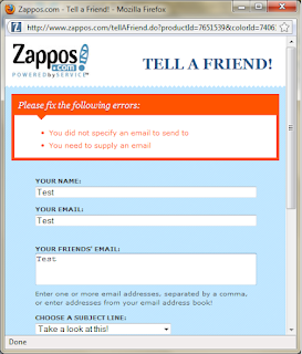
So I was on “Tell A Friend” Window.

After seeing this window I thought to play with this.
I clicked on Send button to see what would happen if values were not filled. On clicking send I saw two error messages. The error messages were:
  • ·         You  didn’t specify an email to send to
  • ·         You need to supply an email

Displaying an error message is not a formality. They could phrase the error messages in much better way.  Also they displayed the error messages in reverse order of the fields on the form. In the above screenshot you can see that the sender’s email address field appears before receiver’s email address. The error message should also display in the same order. This is not a rule but this is always expected.
From error messages it was clear that sender’s name is not mandatory here. Just one questions from all my readers – How many of you know email addresses of your all friends?
As a friend, I know all my friends by their name and not by their email addresses. So, I believe Sender’s name should be mandatory here.
After this I checked for the validations on the fields.
I filled numerals values in sender’s name, email and receiver’s email address fields.

Clicked on send button. The message had been sent.

As you can see there is no validation on sender’s name, email & receiver’s email address. The message had been sent. I didn’t know which poor devil was going to get this mail.
I have doubt that some professional developer has developed this window. It seems any school going kid has done the job. Even they are also aware of these validations.
Now let’s see the max length validation.
I used Perl Clip for generating the string of one million characters and pasted the string in each field.

No surprise, each field has accepted one million characters. Now I wanted to see what would happen if I click on Send button. So I did the job.
I had doubt that this message would ever go and guess what, I was right.

If they had put max length validation for each field, you have not to see this error. From here, I was sure that I was going to get many bugs in this feature.
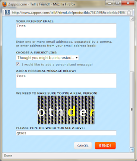
This time I thought to select the checkbox to send a personalize message with the product details. So I clicked on check box. It displayed one more field along with Captcha verification.

I clicked on send button again without filling up any data in any field.

As you can see, It had given the same error messages. I was surprised why it didn’t show any error message for personalize message or Captcha. On looking down I saw that marked checkbox was unmarked. So you see on page refresh the data was lost.
Again, I filled up the complete form

and clicked Send button. See, what I got here.
 

Now, this was the biggest joke. The Captcha verification had been provided but application was unable to check the Captcha. Then, what it was doing here? Moreover, instead of fixing the error, the application was suggesting me to send the message without personalize message.
While sending the product details I wanted to tell my friend that why I have chosen this product for him but I couldn’t do that.
As application was unable to send a personalize message, it had also unmarked the checkbox itself, so I decided to send the product details without personalize message. I clicked on send button again.
What?????
It was still looking for Captcha.

To check behind the curtains I clicked on checkbox.
OMG!!!!

Text message was still there. Captcha also had been refreshed.  It means I couldn’t send product details until I remove the personalize message and Captcha text.
One funny thing I noted here: When Captcha text was incorrect, it has given the right error message but when correct Captcha text was entered earlier it was unable to process.
I was unable to understand whether they are making my job easy or tough. I could send direct mail to my friend much faster rather than using this add-on.
Next, I opened the “Tell A Friend” in Mozilla tab as you can see in the following image.

I wanted to see on clicking Cancel button whether it would close the single tab or all tabs. So I clicked on Cancel button. I was expecting tab to be closed but nothing happened.
So, I filled the data in the field and click on Send button. The message was sent.

I clicked on Close button but as usual nothing happened.
Finally I decided to close the window myself and never tried to open it again. I was frightened with “Tell A Friend”.
Before finishing, I just have one request – Just try to reduce the tasks of a user instead of multiplying them. They have lots of things to do in life. Before releasing, please make it sure that application doesn’t have such kinds of stupid bugs.

Friday, March 26, 2010

Test Report: Tasks

Introduction:

Tasks is a simple To Do manager, using GTK+ and libecal. It eschews complicated features for a simple interface and functionality that does the right thing.
This application is provided by the Ubuntu community.

Objective: To explore the application, review it, list the features and find the issues in the application.

Assign Time: 1 Hr.

Environment: Ubuntu 8.04

This week I tested a small application called 'Tasks'. I start my testing with exploring the application to become familiar with it. The intention was to find the capabilities of the product.

Features: 
  • Simple and Easy Interface make it very user friendly. Very easy to use.
  • Light Weighted Product, Very low CPU usage
 
  • Auto Synchronization if multiple instances are opened
  • User can distribute the tasks in different categories. A category name can hold up to 65534 characters.
  • Long Task Name is allowed. A Task Name can hold up to 65534 characters.
  • The Task can be associated with web address/es if required.
  • Tasks are listed in chronological order of Priority – High Priority task displays on top followed by normal and low priority task.
My Findings:
  • User is able to uninstall the application without closing it which causes user to use the application after un-installation without any error. Here I assumed un-installation doesn't remove the database from the system. Again installing the application recovers all the task listed before un-installation. It strongen my assumption.
  • Allowing the long name for tasks/categories causes the problem sometimes as it expand the dialog boxes and windows out of screen area.
  •  Notes Text box is free length text area. Limited input don't cause any harm but if user enters more and more data, the application starts to display strange behavior like all characters disappears, overwriting of characters and finally application crash.
 
  • No notification to separate the task on the basis of priority. All tasks looks same. Different color or image notification for each priority can increase the usability.
  • The product is stand alone program. A user can use it for personal purpose only. In that case creating tasks for previous date doesn't make any sense to me.
My Review:

Tasks is a very simple and easy to use. The application is very much stable and can be used by anyone in daily life without any problem.

My Doubt: 
Why the max length of the field is set to 65534 and not 65536? Can anyone clear my doubt, please?

Saturday, February 27, 2010

Test Report: KArm

I have been doing the testing since more than two years but I never got a chance to test and desktop application. So I thought to try my hands with desktop applications also. As this is my first chance with testing of desktop application so I would like your suggestions and comments. Your comments will surely help me to improvise.

Here, I would like to share that I usually works on Windows OS and know very little about the Ubuntu which caused me to face few hurdles during testing of the KArm. So, for the time I have limited myself to functionality testing only until I learn the Ubuntu properly.

Now, lets start the testing...

Product Info:
Name: KArm
Version: 1.6.0
Description: KArm is a time tracker for busy people who need to keep track of the amount of time they spend on various tasks.

This package is part of KDE, and a component of the KDE PIM module.
Environment: Ubuntu 8.04


Mission: To test the functionality of the KArm and find the issues in the application.

Date: 27-Feb-2010
Start Time: 11:30 AM
End Time: 01:00 PM

I started my testing with exploring the product so that I could become familiar with the features and functionality of the application. After spending little time with the product, I gain confidence about the product.

After spending 1.5 hrs with the product I found the following issues in the product.

Issues:
  • User can create a subtask for a super task. If no super task is there in the tracker, the Sub Task button should remain disabled
  • The default 'Detect Desktop as idle' time is set to 15 minutes but user is notify just after 1 minute.
  • Unable to launch KArm Handbook
  • There is a feature in Help menu called 'What's This?' On clicking this menu item, the cursor is converted in to a question mark (?). When user click this question mark on any button in the standard menu bar or column header, it display the details of that screen element. The feature doesn't display detail for 'Sub Task' button
  • User should not be allowed to open the multiple instance of the product.As each instance displays the same task list so there is no use of opening multiple instance.
  • Opening the multiple instances also caused the KArm to display different timings of same task.
  • If multiple instances of the product is opened, it displays the error of shortage of disk space although there is sufficient disk space.

  • While adding/editing a task, the user can enter absolute/relative hours. Here the hours field can accept number up to 9 digits. If user inserts a long digit, it cause the error in time calculation.
  • Clock should display whenever it is started by user but the clock displays only if Session Time column is configured to display and user has started the clock.
  • Product crashed twice during the testing although I couldn't find out the reason due to lack of time but I hope to find it soon.


Learnings:
Overall it was a good experience to test an application for self confidence and improvisation. Today, I came to know that I lacks in test ideas while testing desktop products. Moreover, I need to learn the Ubuntu to do well with my testing. If a tester is not able to use the environment properly, he could not perform the satisfactory testing of the product.