Home

Showing posts with label Product Review. Show all posts

Tuesday, March 27, 2012

Reviewing qTrace: An Heuristic Approach

Few days back I came to know about a tool called qTrace from QASymphony. I am sure most of you must have heard about this tool but if you are one of those who missed it for some reason then this blog post is definitely for you. This post can also help you if you are testing qTrace or any other similar tool.

When I came to know about the qTrace I found it interesting and thought to try it. I downloaded the free trial version from here and installed it on my machine. The trial version of qTrace is valid up to 30 days so I always knew that I would definitely get  some time to review qTrace.

To know the tool better I started with the Touring Heuristic FCCCUTSVIDS by Michael D Kelly. The following report is based on my findings by using FCCCUTSVIDS heuristic on qTrace. This report gives the idea what could be tested in qTrace or any other similar application.

Features: I started exploring qTrace for the features. Few of the features which I found include:

  • qTrace captures the screen of the selected application. User can take the single picture or can record the whole session of testing. qTrace automatically records the testing steps.
  • User can also record the notes while testing the application. It’s a very good feature which can be used smartly while doing the exploratory testing
  • Add the Environment Information of the bug into bug report without any effort. qTrace records the environment information and avails it on a single click.
  • User can edit the captured screenshots and annotate them with important information.
  • Submit the bug reports directly to associated bug Tracker. qTrace can associate with major bug tracking tools like Bugzilla, Jira, HP Quality Centre etc.
  • Email the bug reports to the concerned person.
  • Bug Reports can be saved in famous formats like Word, PDF & JPG format

Complexity: qTrace is very user friendly and easy to use. The most complex features which I would like to test thoroughly are as follows:

  • Association with different Bug Trackers.
  • To handle Large size Bug Reports can be a challenge for qTrace. It’s a region where we can find the issues
  • qTrace can be used on three different machines with same licence.
  • Emailing the bug reports
  • Recording the testing steps with important notes.

Claims: The best place to find the claims about a product is to search the product site or help documents so I used the both of them. Following are the claims which I found about the product on the product site and help documents:

Claims My Views
qTrace is a software testing and reporting tool that makes quality control simpler, faster, and more seamless. With qTrace you can easily record defects, edit details, and share results. Agree with most of the claims. Not Agree with the Quality Control claim.
qTrace is for anyone looking to improve defect reporting, boost productivity, and speed quality control cycles to help bring products to market more quickly. Agree with improve defect reporting claim. Partially Agree with the boost productivity claims and not agree with the Quality Control claim.
qTrace helps you and your team be more productive. It streamlines defect documentation while seamlessly meshing with your existing tools and processes. Partially Agree
Automatically documents every screen and every step of a defect or test case Agree
Capture all defect information to document an issue and submit a complete bug report directly to Jira, Bugzilla, HP QC, Team Foundation Server, VersionOne or qTest. Agree
Seamlessly integrates with leading defect tracking tools Partially Agree
Simplify defect reporting Agree
Point-and-click to start recordings Agree
Publish reports with screen shots, user actions and system specifics Agree
qTrace is Simple and Intuitive to Use Agree
qTrace Makes Documenting Defects a Breeze Agree
qTrace Complements Your Existing Tools Agree
qTrace Eliminates the Drudgery of Testing Not Agree
qTrace Helps Your Team Be More Productive Partially Agree

Configuration: I could find only following two ways to change the configuration of qTrace.

  • Settings in the Application
  • qTrace.exe.config file in Program Files

Let me know if there is any other way to change the configuration.

Users: I could imagine the following users (&groups) who could use the qTrace or qTrace outcome directly or indirectly.

  • Software Tester
  • Software Developer
  • Test Manager/ Project Manager
  • IT Admin
  • Top Management
  • Client

The scenarios for each user is described below in Scenario section

Testability: Testability tour helped me to find out the testable feature of the qTrace. Major testable features are listed below:

  • Capturing the Screenshots
  • Automatic recording of the testing steps
  • Adding the notes
  • Submitting the bug report to Bug Tracker
  • Emailing the bug report
  • Configuration Settings
  • Opening/Editing the .trace file
  • Annotating the reports
  • Association with different Bug Tracking Tools
  • Adding/Editing/Deleting/Moving the Steps
  • Saving Bug Report in different formats

Scenarios: I found the following scenarios for the users I found during the User Tour.

  • Software Tester: A software tester can use qTrace for testing the application. During testing he would like to use it for recording the testing steps, taking the notes, taking the screenshot of the bugs, submitting the bugs, emailing the bugs etc.
  • Software Developer: A Software Developer is the one who is going to fix the bug so it is very important that recorded bugs are well described including the steps, screenshots and environment. All these information will help a developer to fix the bugs quickly. So while testing the qTrace it is necessary to know the Developer’s perspective on the bug reports.
  • Test Manager/Project Manager: Test Managers/Project Managers are the one who are more concerned about the outcome and productivity. There is no doubt qTrace helps testers to generate descriptive bug reports with all the supporting screenshots and reproducible steps so overall it will definitely help their productivity with the quality of the bug reports
  • IT Admin: You must be wondering how qTrace can be used IT Admin. The IT Admin is one who takes care of your machine and application installed on it. From IT Admin’s perspective following features should be available with the qTrace:
    • IT Admin may want to associate the qTest with the in-house bug tracking tool or any other commercial bug tracking tool being used in the organization. There should be an option to associate the qTrace with the in-house bug Tracking Tools.
    • Concurrent Licence similar to QTP Concurrent Licence. Managing 200 or 300 licences could be a tedious job. Having the concept of Concurrent licence will ease his job.Right now, maximum three users can use qTrace with same credentials and Licence
    • Every BT has size limit for the files being attached. IT Admin would like to Define the Maximum File Size of the attachments as per the limitation of associated Bug Tracking Tool and Email Client
  • Top Management: The top management is always worried about the money. In qTrace reference they must want to know the cost about the tool. So, for there reference qTrace is not the expensive tool. The cost is very reasonable and can easily bear by the management.
  • Client: Some clients want to see the issues, especially, if testing is outsourced. A good bug report gives a good impression about the testers and their organization and qTrace can help testers to generate a very good bug report.

Variability: The Variability tour is about the things which we can change in the application. Following are the things which I found testable based on the Variability Tour.

  • Default Save Location
  • Attachment format for email and BT
  • Image Quality
  • Annotation Font, Size and Color
  • Defect Tracker
  • Environment

Interoperability: qTrace interacts or might interact with the following applications:

  • Windows Environment
  • Microsoft Outlook
  • Configured Bug Tracker

Let me know If I am missing any application.

Data: What could be the input data for an image grabber tool? I could find the following data which can be an input for qTrace.

  • Recording Environment
  • Captured Images ( for annotation of captured images)
  • Input Data for eg: Text, Numeral etc. for Notes, Title, Bug Description
  • Bug Reports (which will be send to Bug Tracker and Email)

Structure: Structure Tour couldn’t help me much in this context as I have only exe file of the application.

My Recommendation: Although I just had a tour of qTrace, actual testing is still pending but after touring it I can confirm one thing: This tool is a boon for software testers. Bug Reporting is an area of testing  process where a tester spends a lot of time, especially, if we are talking about good bug reports. qTrace saves a lot of bug reporting time. It prepares well descriptive bug reports for the testers which can be submitted with small changes in it. Sometime, no change is required. I would like to add this tool in my testing armour.

Things I would like to have in qTrace someday:

  • Association with In-house bug tracking tool. Also, Mantis BT is one of most used bug tracking tools. I am wondering why qTrace is not allowed to associate with the Mantis BT.
  • Video Recording of the bugs

Please comment if you have any question or any suggestion.

Saturday, November 13, 2010

A Feature which have become Bouquet of Bugs


Recently, I was testing an online shopping site – just for fun, nothing official. There I saw a feature called as “Tell A Friend”.  I found this feature useful in first glance. During shopping, if you see any product which you find usable for your friend and you think your friends might be interested, just forward info about the product in the mailbox of your friend. You just have to write name & email address of your friend. I think this is great idea to make new customers.
So, I thought to take my hands on this feature but I was highly disappointed when I used this feature. In hurry to introduce the new feature, the site managers kept a bouquet of bugs on the site. Let’s come with me to see the dissection of this feature with me.
Oh… I forgot to tell you the store name. It’s Zappos.com. First, some introduction with Zappos:
Zappos.com is an online shoe and clothing shop. Since its founding in 1999, Zappos has grown to be the largest online shoe store. Zappos did "almost nothing" in sales for 1999, but grossed over USD$800 million in merchandise sales in 2007 and grossed over $1 billion in 2009.
On Zappos.com I selected a product to see its description. The product seemed good to me and I was sure one of my friends would be interested in this product. I decided to forward the details of the product to my friend. So I clicked on “Tell A Friend” button available on the product page.

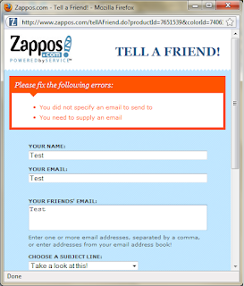
So I was on “Tell A Friend” Window.

After seeing this window I thought to play with this.
I clicked on Send button to see what would happen if values were not filled. On clicking send I saw two error messages. The error messages were:
  • ·         You  didn’t specify an email to send to
  • ·         You need to supply an email

Displaying an error message is not a formality. They could phrase the error messages in much better way.  Also they displayed the error messages in reverse order of the fields on the form. In the above screenshot you can see that the sender’s email address field appears before receiver’s email address. The error message should also display in the same order. This is not a rule but this is always expected.
From error messages it was clear that sender’s name is not mandatory here. Just one questions from all my readers – How many of you know email addresses of your all friends?
As a friend, I know all my friends by their name and not by their email addresses. So, I believe Sender’s name should be mandatory here.
After this I checked for the validations on the fields.
I filled numerals values in sender’s name, email and receiver’s email address fields.

Clicked on send button. The message had been sent.

As you can see there is no validation on sender’s name, email & receiver’s email address. The message had been sent. I didn’t know which poor devil was going to get this mail.
I have doubt that some professional developer has developed this window. It seems any school going kid has done the job. Even they are also aware of these validations.
Now let’s see the max length validation.
I used Perl Clip for generating the string of one million characters and pasted the string in each field.

No surprise, each field has accepted one million characters. Now I wanted to see what would happen if I click on Send button. So I did the job.
I had doubt that this message would ever go and guess what, I was right.

If they had put max length validation for each field, you have not to see this error. From here, I was sure that I was going to get many bugs in this feature.
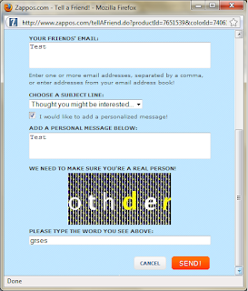
This time I thought to select the checkbox to send a personalize message with the product details. So I clicked on check box. It displayed one more field along with Captcha verification.

I clicked on send button again without filling up any data in any field.

As you can see, It had given the same error messages. I was surprised why it didn’t show any error message for personalize message or Captcha. On looking down I saw that marked checkbox was unmarked. So you see on page refresh the data was lost.
Again, I filled up the complete form

and clicked Send button. See, what I got here.
 

Now, this was the biggest joke. The Captcha verification had been provided but application was unable to check the Captcha. Then, what it was doing here? Moreover, instead of fixing the error, the application was suggesting me to send the message without personalize message.
While sending the product details I wanted to tell my friend that why I have chosen this product for him but I couldn’t do that.
As application was unable to send a personalize message, it had also unmarked the checkbox itself, so I decided to send the product details without personalize message. I clicked on send button again.
What?????
It was still looking for Captcha.

To check behind the curtains I clicked on checkbox.
OMG!!!!

Text message was still there. Captcha also had been refreshed.  It means I couldn’t send product details until I remove the personalize message and Captcha text.
One funny thing I noted here: When Captcha text was incorrect, it has given the right error message but when correct Captcha text was entered earlier it was unable to process.
I was unable to understand whether they are making my job easy or tough. I could send direct mail to my friend much faster rather than using this add-on.
Next, I opened the “Tell A Friend” in Mozilla tab as you can see in the following image.

I wanted to see on clicking Cancel button whether it would close the single tab or all tabs. So I clicked on Cancel button. I was expecting tab to be closed but nothing happened.
So, I filled the data in the field and click on Send button. The message was sent.

I clicked on Close button but as usual nothing happened.
Finally I decided to close the window myself and never tried to open it again. I was frightened with “Tell A Friend”.
Before finishing, I just have one request – Just try to reduce the tasks of a user instead of multiplying them. They have lots of things to do in life. Before releasing, please make it sure that application doesn’t have such kinds of stupid bugs.

Tuesday, April 27, 2010

Navigating the Quirks: A Light-Hearted Look at Gmail's User Experience Blunders

I would like to dedicate this post to Santhosh Tuppad. It was Santhosh's post and the comments on the post which gave me idea to write this post. The post is going to heart break some Google fans but I think now they should accept that Google is also fallible.

Mission: To display the stupid mistakes to Google devotees in Gmail Registration form.
Time: 0.5 Hrs

How should I change the language here?
Scenario: I am a common user and I don’t have internet access at home so I go to cyber café to use the internet services. On such a public computer, I opened the GMail and found the following screen:


I don’t know Hindi so I am unable to read the content on the screen. How could I change the language to English?

Perhaps, Google forgot to provide the Change Language dropdown here.

GMail Help – Most Stupid Mistake
Scenario: I am using the GMail in Hindi and clicked on ‘Can’t access your account?’ link (Written in Hindi Translation) and redirected to following page:

 Somebody must tell Google that upper right side should be towards upper side of the page and not at bottom of the page.

Now I have doubt on Google’s direction sense. How could I believe on Google Earth now?

Where is the play captcha image?
I am wondering where the play captcha image for this captcha is.

 Play Captcha image: The wheelchair icon with captcha, on clicking you'll be presented with an interesting voice version of the captcha. This is generally used by physically disabled people.

Where is the Refresh button with Captcha image?
Scenario: I am unable to understand the letters in the captcha image. What should I do here?

Should I submit the incorrect word and try again for the new captcha, there is not guarantee that letters in new captcha will be readable

Or Should I refresh the page which will cause the lost of information that I already filled up.

Sorry, we are unable to present username suggestions at this time.

See the screenshot below:


There could be various reasons for this message:
1. GMail server might be busy with any female server :D
2. Its lunch time. :D
3. GMail server may be using the loo :D

Actually, GMail server suggests username on the basis of First name and Last Name entered by user and username can be in English Language only. Here, I have entered Hindi letters and he couldn’t process the request so instead of displaying its inability to suggest username, it has given this error message.

Incorrect Hindi Writing
Neither I had time to search them all nor do I have any spellchecker for Hindi Language so I have mentioned only one mistake in the screenshot. There might be more mistakes in Hindi Spellings.

 The word should be written as ऊपर and not उपर


Displaying Error message without wrong Input

When I clicked on Check availability button, it displayed me a captcha with a field to enter the characters in the captcha and an error message which says
The characters you entered didn't match the word verification. Please try again.

When I didn't enter any word then why they are saying that I have entered incorrect word. This message should appear if I enter the incorrect characters.


Relevant Information is not available on Time

I have filled up the password with the characters which are not allowed by GMail. It displayed me the following error after submitting the form:

The following characters are allowed in your password: a-z, A-Z, 0-9, and common punctuation characters.

If password characters were not valid then why didn’t it displayed the error when I tabbed from the choose password field to next field i.e. re-enter password.

If it has displayed the error at right time I could save a lot of time.

I hope GMail server is not allergic to the user name which I have selected.

In the screenshot, see the distance between the field and error message. It seems that GMail server is allergic to the selected username and that’s why the error message going far away every time I click check availability button.


I am not sure but the reason might be: Whenever user clicks on ‘Check Availability’ button, it generates same error message. To avoid the duplication of error messages, the developer had hid the repeating error message.

The funny thing is when these kind of stupid mistakes are mentioned by any passionate tester who is doing it without any greed, few people got offended. According to them “No one will die and no two countries will go to war.” Believe me if we tester start to keep this point in mind, we don’t need UI / Look and feel testing then.

It took just 30 minutes to find the above issues and I am sure if any tester devotes his some time he can find more issues in Google products.

Trust the Google but with open eyes.

Friday, March 26, 2010

Test Report: Tasks

Introduction:

Tasks is a simple To Do manager, using GTK+ and libecal. It eschews complicated features for a simple interface and functionality that does the right thing.
This application is provided by the Ubuntu community.

Objective: To explore the application, review it, list the features and find the issues in the application.

Assign Time: 1 Hr.

Environment: Ubuntu 8.04

This week I tested a small application called 'Tasks'. I start my testing with exploring the application to become familiar with it. The intention was to find the capabilities of the product.

Features: 
  • Simple and Easy Interface make it very user friendly. Very easy to use.
  • Light Weighted Product, Very low CPU usage
 
  • Auto Synchronization if multiple instances are opened
  • User can distribute the tasks in different categories. A category name can hold up to 65534 characters.
  • Long Task Name is allowed. A Task Name can hold up to 65534 characters.
  • The Task can be associated with web address/es if required.
  • Tasks are listed in chronological order of Priority – High Priority task displays on top followed by normal and low priority task.
My Findings:
  • User is able to uninstall the application without closing it which causes user to use the application after un-installation without any error. Here I assumed un-installation doesn't remove the database from the system. Again installing the application recovers all the task listed before un-installation. It strongen my assumption.
  • Allowing the long name for tasks/categories causes the problem sometimes as it expand the dialog boxes and windows out of screen area.
  •  Notes Text box is free length text area. Limited input don't cause any harm but if user enters more and more data, the application starts to display strange behavior like all characters disappears, overwriting of characters and finally application crash.
 
  • No notification to separate the task on the basis of priority. All tasks looks same. Different color or image notification for each priority can increase the usability.
  • The product is stand alone program. A user can use it for personal purpose only. In that case creating tasks for previous date doesn't make any sense to me.
My Review:

Tasks is a very simple and easy to use. The application is very much stable and can be used by anyone in daily life without any problem.

My Doubt: 
Why the max length of the field is set to 65534 and not 65536? Can anyone clear my doubt, please?